


I’ve recently been listening to a podcast series by Dave Austin. Dave is a mental performance coach who stresses the importance of narrowing down thoughts and getting “in the zone”– visualizing success, and being so focused that nothing in the world can stop you from getting the job done.
All of this talk of visualization began to translate into reality as I sat in a meeting two weeks ago. In this meeting, we discussed a spreadsheet with data related to sales opportunities and the quote process. As I looked at all of the tabs and summary sheets, littered with several rows and columns of data, I asked, “What is it that you’re tracking and why?”
The team explained that they reviewed this data on a weekly basis to view all current and upcoming activities. ‘Ok, that’s a good start,’ I thought to myself. Then I asked what this data was telling them about the health of sales or which clients had the best quote-to-purchase rate. They had no idea. Why? They couldn’t visualize the numbers they had.
Visualization is defined by dictionary.com as: to make visual or visible or to form a mental image of.
Data in and of itself is facts or figures — pieces of information not yet processed. When data is organized and structured so that it becomes meaningful, and visual, we get information.
 VS.
VS. 
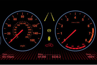
Today, we have countless ways to capture data. However, just capturing it doesn't make it meaningful. Consider your car. You have components such as tires, an engine, and a gas tank. Now, think about how you know the health of those components. The dashboard tells you. It gives you a visual of your speed, gas consumption and oil requirements. In newer model cars you have gauges that monitor all kinds of data. The dashboard uses that data to provide the driver with information that can be used to make decisions.
Now let’s apply this to business. Consider your sales data. You have names, numbers, quotes and proposals, product sales, and yearly sales. All of these began as data points, usually captured in spreadsheets. Take that data and give it context, transforming it into information. You now can make decisions because you can visualize the story.

If you're looking to visualize data to create information, consider doing the following:
- On paper, draw a picture of what you want to see on your dashboard
- Identify the data you must collect
- Accumulate the data points in one place
- Find a resource - your data artist - to help create this dashboard.
- Allow your data artist to paint your dashboard
- Play with it, have fun, and create
- Be patient - it's a process and may require several iterations - and it will grow
- Sit back and enjoy the clarity!
When you arrive at your dashboard you now know what you must pay attention to. It’s portrayed by that low bar graph, or that sliver of a pie chart that should be bigger. You can make corrections, avoid losses, and understand the best markets and product growth. Your sales data is the portrait of your future. You have to understand it - embrace it and let it guide your decisions with clarity.


Comments